
In the world of data analysis and visualization, heatmaps have become an invaluable tool for representing complex data in a more understandable and visually appealing way.
Heatmaps provide a concise and intuitive representation of data, making it easier to identify patterns, trends, and outliers within large datasets.
In this article, we will explore the concept of heatmaps, their applications across various fields, and how they can be a game-changer for decision-makers and researchers alike.
What Are Heatmaps?
A heatmap is a graphical representation of data where individual data points are represented as colors on a two-dimensional matrix.
The intensity of the color at each point in the matrix corresponds to the value of the data point it represents.
Typically, a color spectrum is used to represent values, with warmer colors (e.g., red) indicating high values and cooler colors (e.g., blue) indicating low values.
Heatmaps can be used to visualize various types of data, including numerical, categorical, and even spatial data. They are versatile and can be applied to a wide range of fields and applications.
Applications of Heatmaps
- Data Exploration and Analysis Heatmaps are powerful tools for exploring data and identifying patterns. They can be used to reveal correlations between variables, making it easier to discover hidden insights within datasets. For example, in financial analysis, heatmaps can be used to visualize the correlation between different assets in a portfolio.
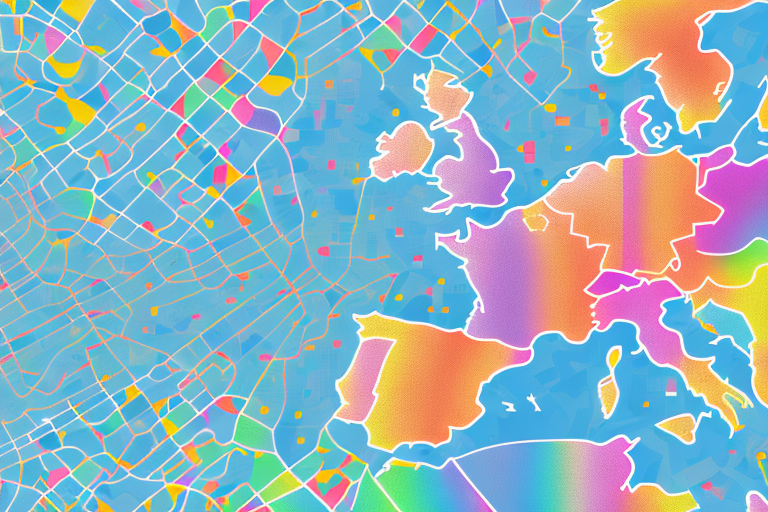
- Geographic Information Systems (GIS) In GIS, heatmaps are used to visualize spatial data. For example, they can represent population density, disease outbreaks, or even traffic congestion in a city. By using a color scale to represent intensity, they provide a clear picture of spatial distribution.
- Website and User Experience Analysis Heatmaps are widely used in web analytics to track user behavior. By creating heatmaps of user interactions on a website, businesses can identify areas of interest, user preferences, and potential issues in the user experience. This can lead to improved website design and performance.
- Biological and Medical Research Heatmaps are essential in genomics, proteomics, and other biological research areas. They are used to visualize gene expression levels, protein interactions, and more. Researchers can quickly identify gene clusters or other biological patterns, which can be crucial in understanding diseases and genetic conditions.
- Stock Market Analysis Traders and investors use heatmaps to track market performance. Heatmaps can represent stock price movements, volume, and other market indicators. This visual representation allows for quick identification of trends and helps in making informed investment decisions.
Creating a Heatmap
Creating a heatmap is relatively straightforward with the help of data visualization tools and software like Python’s Matplotlib, Seaborn, or specialized software such as Tableau. Here’s a basic process to create a heatmap:
- Prepare your data: Ensure your data is in a suitable format for creating a heatmap.
- Choose a color scale: Select a color palette that makes sense for your data. Choose colors that represent high and low values appropriately.
- Plot your data: Use your chosen tool to generate the heatmap. Most tools allow you to customize the appearance, labels, and other aspects of the heatmap.
Conclusion
Heatmaps have revolutionized the way we visualize and analyze data, making complex information more accessible and insightful.
Their applications are vast, ranging from data exploration to medical research and user experience analysis.
With the increasing availability of data visualization tools, more individuals and organizations can harness the power of heatmaps to drive data-driven decisions and discoveries.
As data continues to grow in complexity and volume, heatmaps will remain an indispensable asset for anyone seeking to uncover hidden patterns and insights within their data.